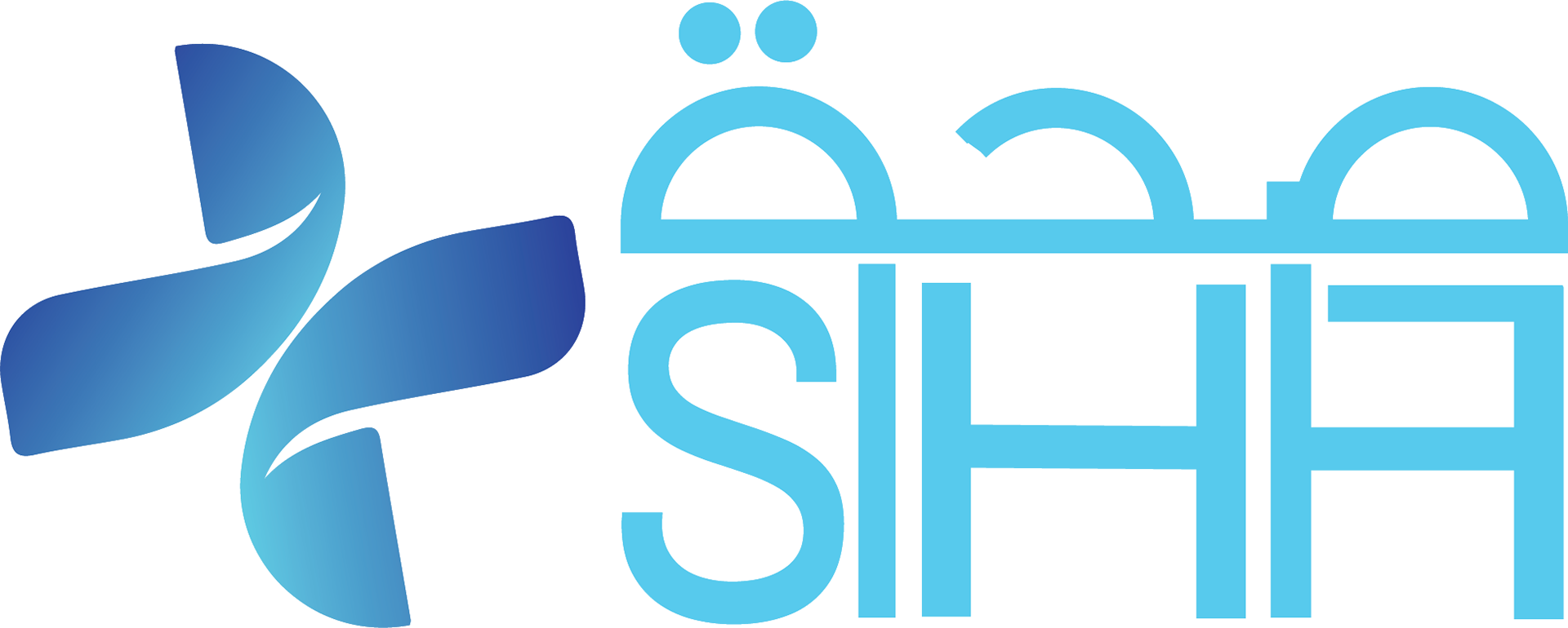
This project is a logo developed for Siha, aiming to create a clean and modern identity that reflects health, care, and wellbeing.
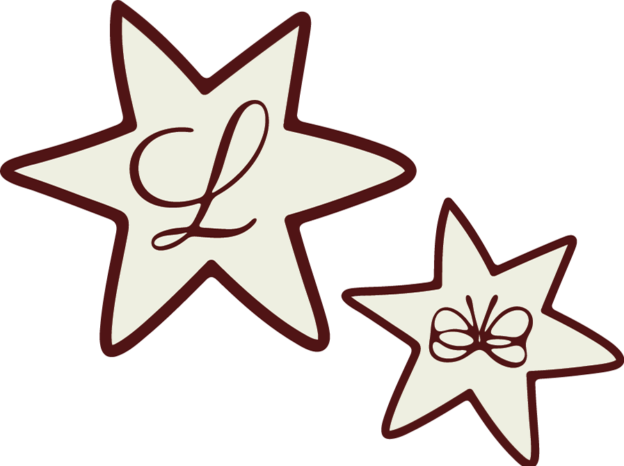
The process began with research into visual elements commonly associated with healthcare and wellness, where the cross was explored as a symbol of care, support, and medical reliability, and the butterfly as a representation of transformation and growth. Initial ideas focused on combining and abstracting these concepts, followed by digital refinement to achieve a balanced and minimal direction.
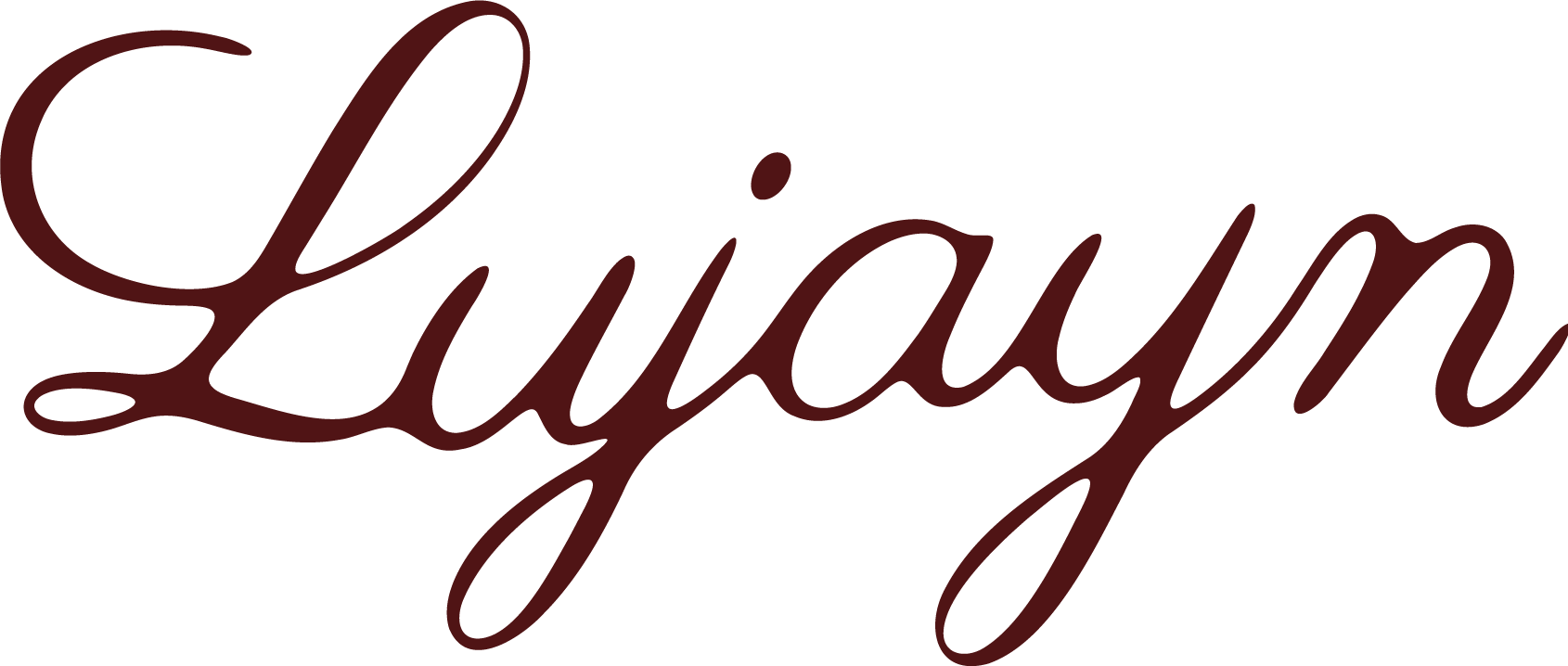
The final logo is a custom typographic mark with rounded edges, conveying approachability and comfort. The outcome was developed collaboratively with the team, translating the initial concepts into a refined vector solution using Adobe Illustrator, resulting in a clear and adaptable identity aligned with Siha’s focus on wellbeing.
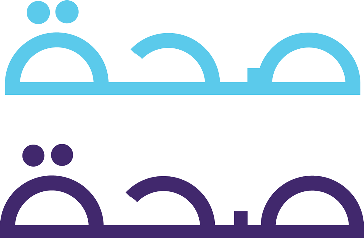
Initial Logo Direction (Pre-Refinement)