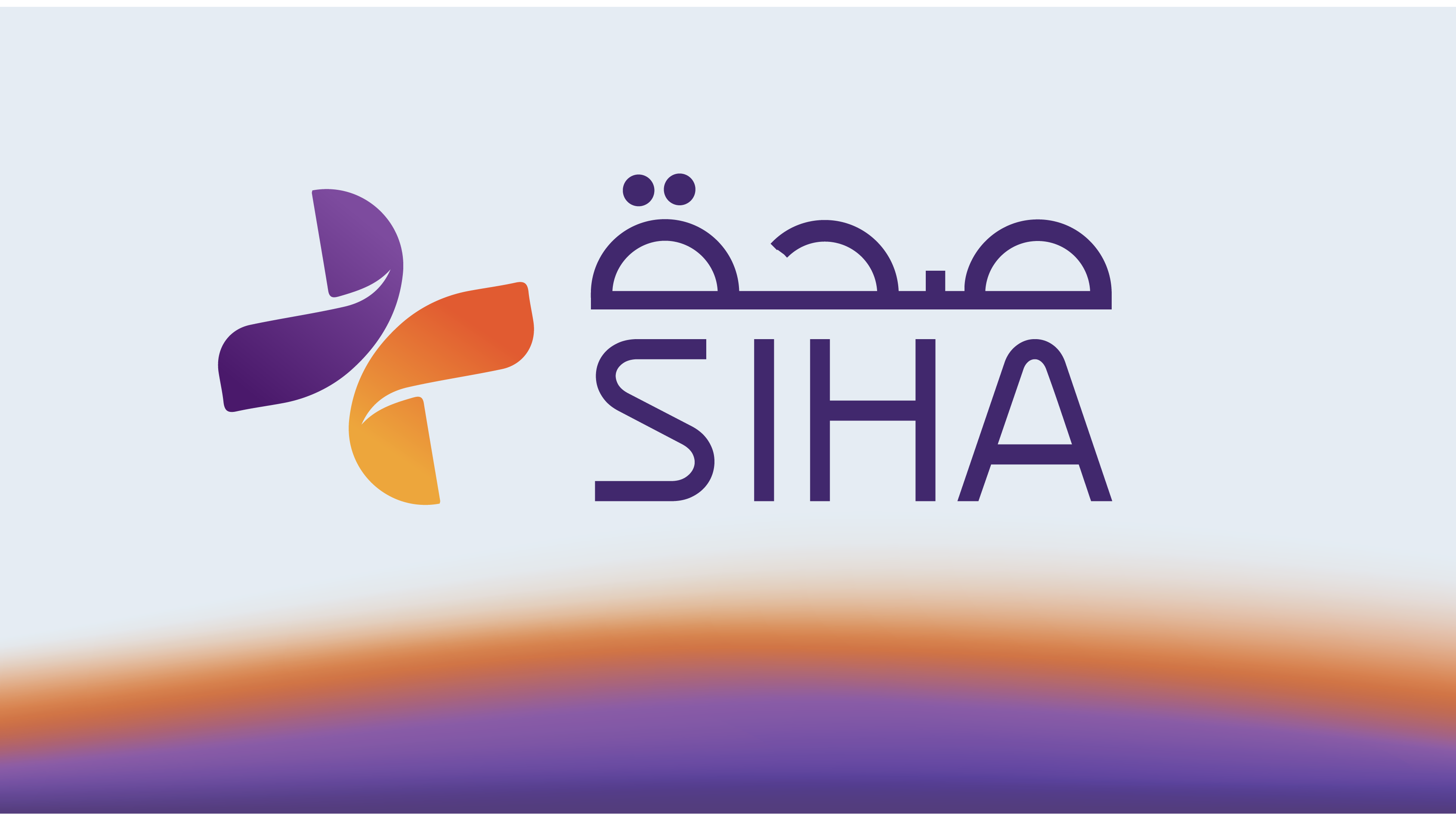

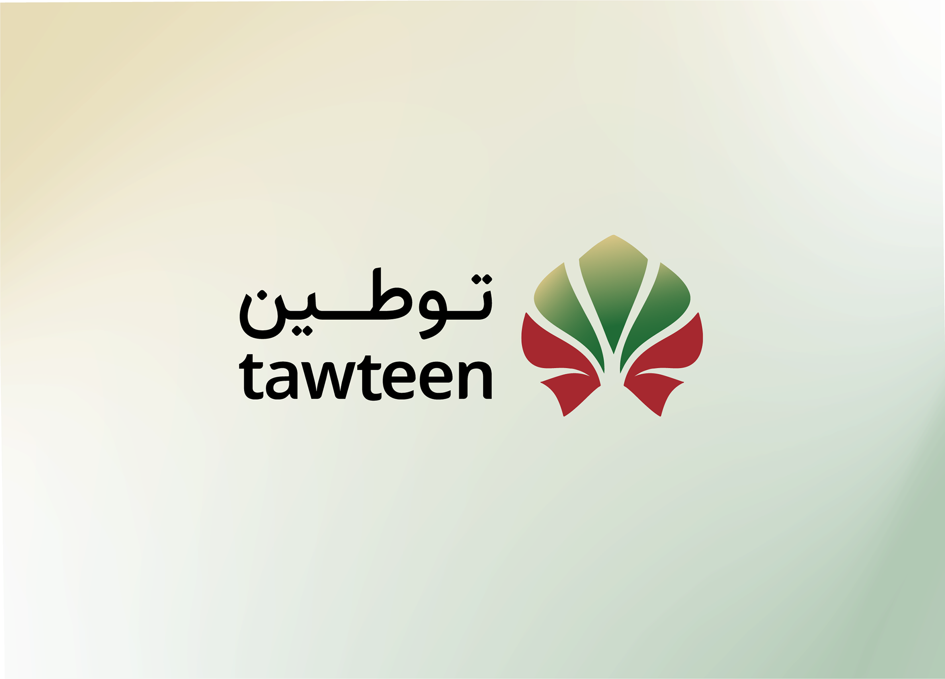
This project is a Logo Re-Branding and Visual Identity developed for Tawteen, focusing on creating a modern and adaptable visual identity that reflects national workforce development and economic growth. The objective was to translate the concept of employment, empowerment, and collective progress into a clear and recognisable mark.
The project was executed using Adobe Illustrator, moving from initial sketches to a fully vectorized identity. The result is a cohesive and functional mark that aligns with Tawteen’s role in supporting sustainable workforce growth.
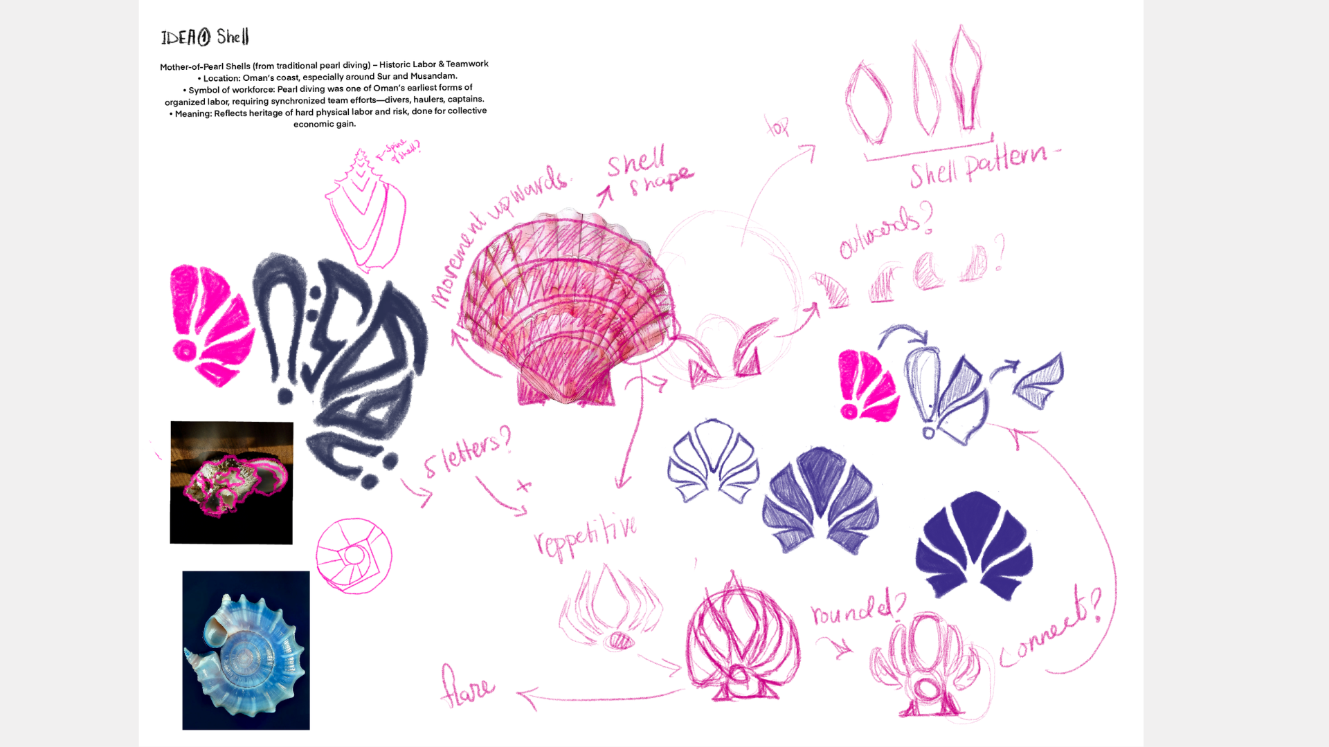
Early stages sketch and ideation
Initial concepts were explored through hand sketches, focusing on form, structure, and symbolic representation. These early explorations examined ideas of growth, movement, and unity through abstract shapes and layered compositions.
The selected direction was developed digitally, refining proportions, alignment, and visual balance.